Some projects come your way, and you just know they're bigger than the assignment. This was one of them.
Nevada Football was entering a new chapter. Something that said we're back, without saying a word. When I got the call to lead the design, I knew this had to go deeper than colorways and logos. It had to carry legacy, pride, and that Wolf Pack grit that doesn’t show up on stat sheets, but something you feel it in your chest on a cold night at Mackay. This was about more than gear. This was about identity.

For nearly a decade, Nevada’s uniforms had gone quiet. After the switch to adidas, the spark & the personality faded. No bold accents. No standout details. Just plain, functional gear that got the job done but never turned heads. It felt like the Pack had lost its edge, at least in how they looked stepping off the bus. This project was our shot to change that.
It was our job to inject life back into the uniforms, the flare that makes players feel faster, fans feel prouder, and opponents think twice.
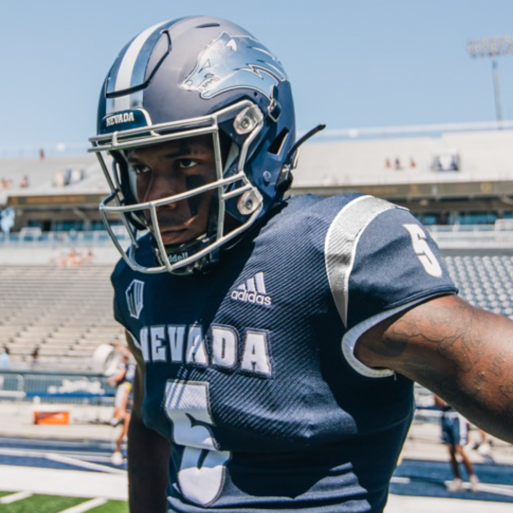
It was time for Nevada to look like Nevada again.
Once the vision was sketched out, I started building out mockups.
Different stripe combos. Helmet finishes. Fonts. Shoulder patterns. I tried a little bit of everything to see what hit. Some felt classic. Some felt out there. All of them had a reason behind them, even if they didn’t make the final cut.
Then I brought in the staff.
Coaches, equipment staff, operations—they all had opinions, and that’s exactly what I wanted. We sat down, laid everything out, and started picking it apart. What felt right? What didn’t? What actually felt like Nevada?
Slowly, the noise started to clear. We zeroed in on a look that felt bold, clean, and sharp. One that didn’t try too hard but still had something to say. Something that looked like us.

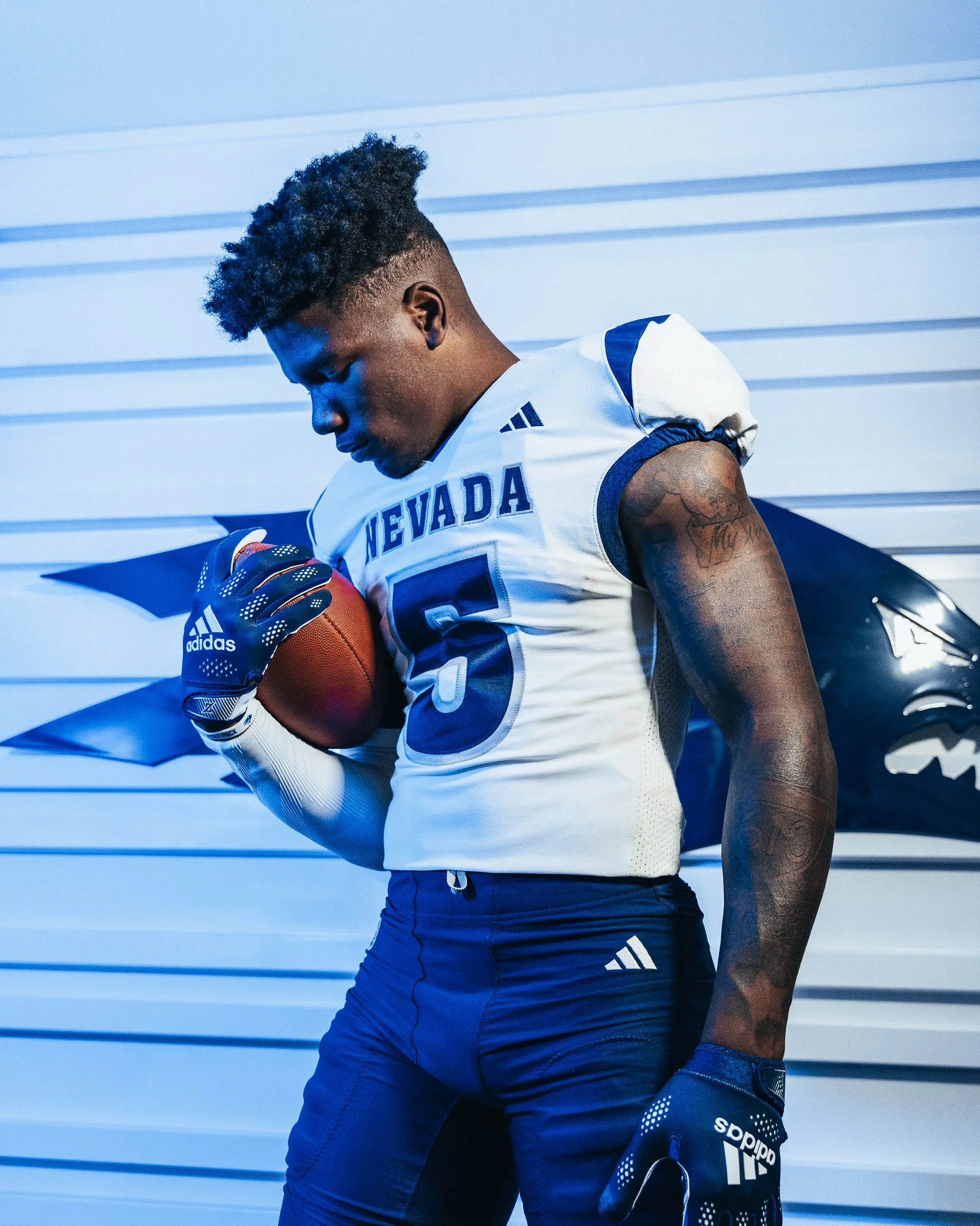

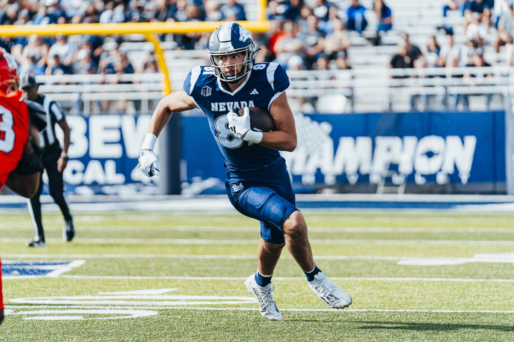
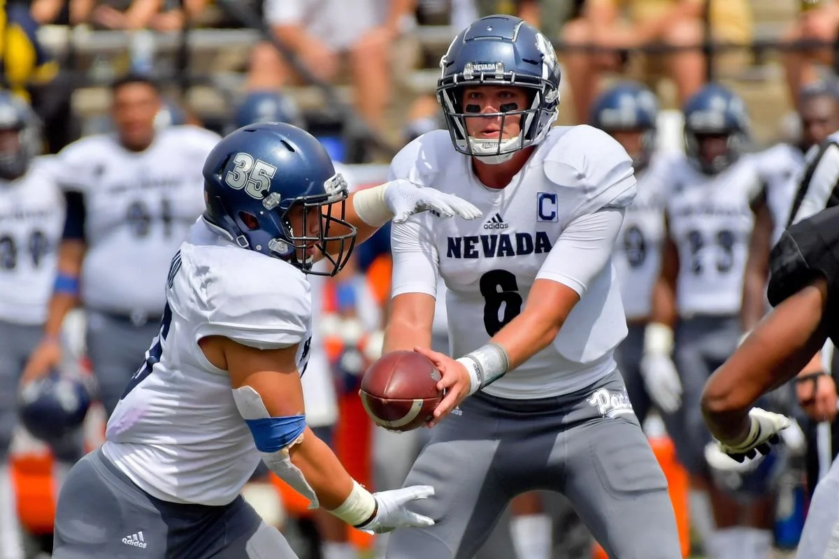
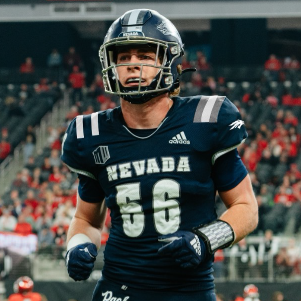
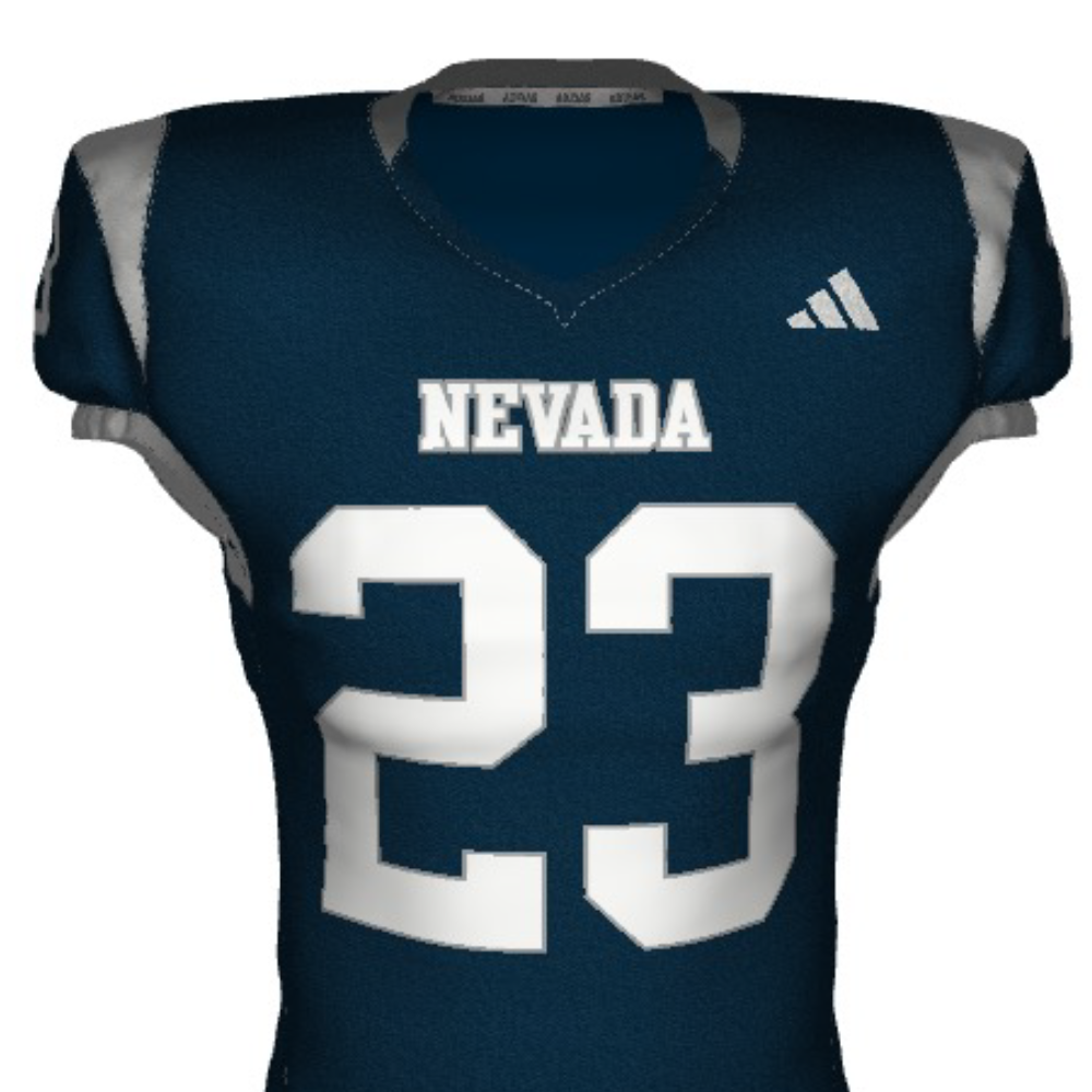
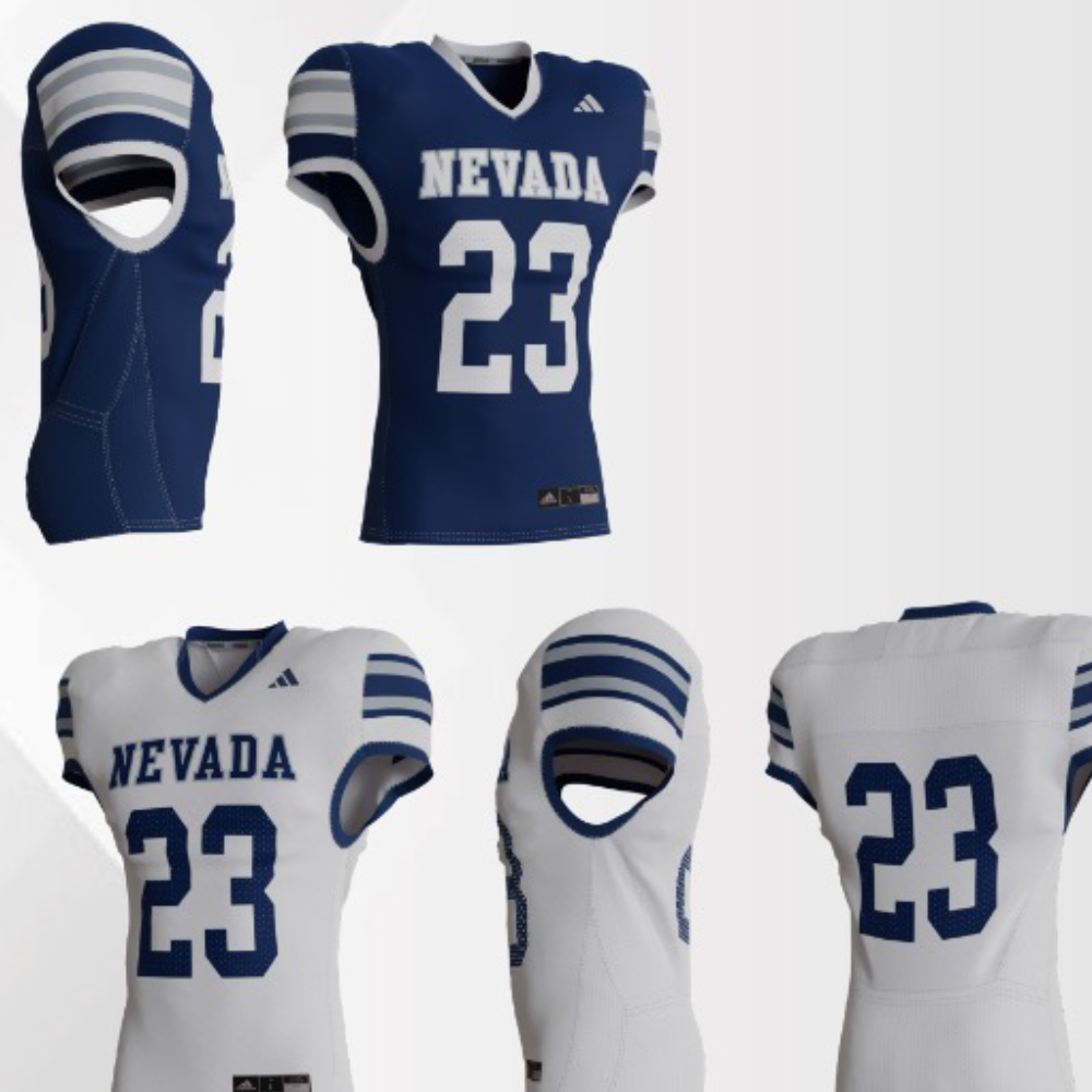
We wanted to bring aspects of former Nevada jerseys by making word-mark changes to resemble that of the early 2010’s uniforms, as well as moving the numbers to the top of the shoulders for the first time since 2012. The “Wolf Fang” stripe makes its return, a call back to the mid 2000’s. Additionally, both the nameplates and numbers have been enlarged, making them much more legible for everyone.